Shuffle
ROLE
Web Design
Product Design
TEAM
Product Manager
Frontend team
TOOLS
Figma
FigJam
From old design to
modern growth.
I led the redesign process for Shuffle a small growing Cybersecurity automation company that aims to make security operations simpler, efficient and scalable.
Avg. User engagement
~ 48%
Year-over-year
~ 70%
Pre. vs Post Launch
Deliverables
Challenge
The website was failing to communicate the product’s values
which lead to higher drop-off rates.
The website was overload with paragraphs of texts, which lead to users not engaging with content and leaving quickly. On top of that, an outdated design kept the company from standing out in a competitive market.
Research & early stages
Defining the pain points with the old design
Hero section that lacks hierarchy and clear communication of value
Combined with an outdates look the hero section fails at it’s core purpose - communicating effectively the what, how and why.
Endless scrolling, too much text and
zero value
Valuable information was buried under mountains of text with no clear CTAs making it difficult for the user to orient themselves and build trust.
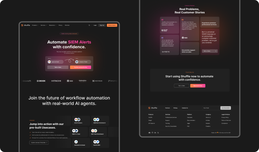
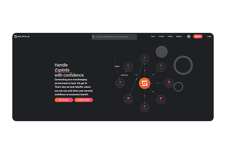
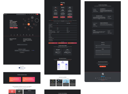
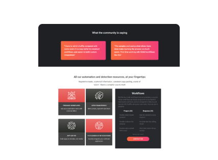
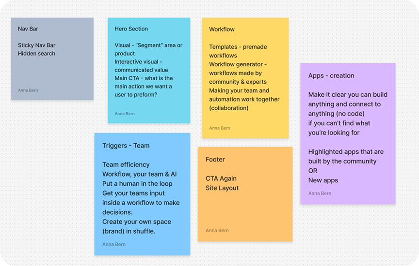
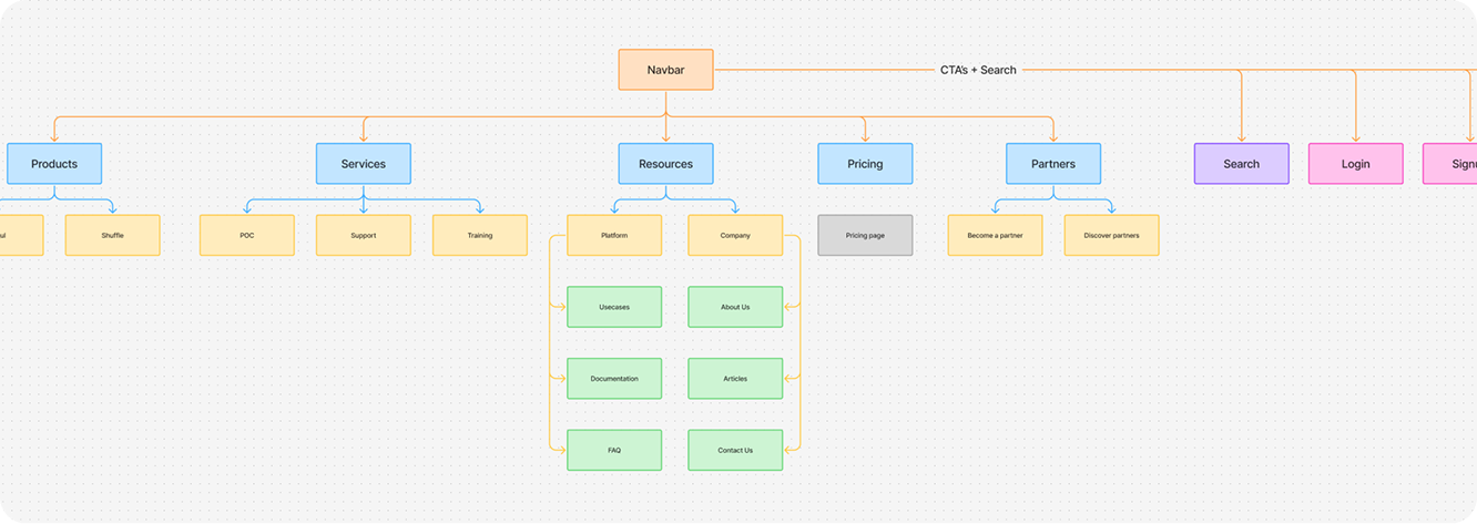
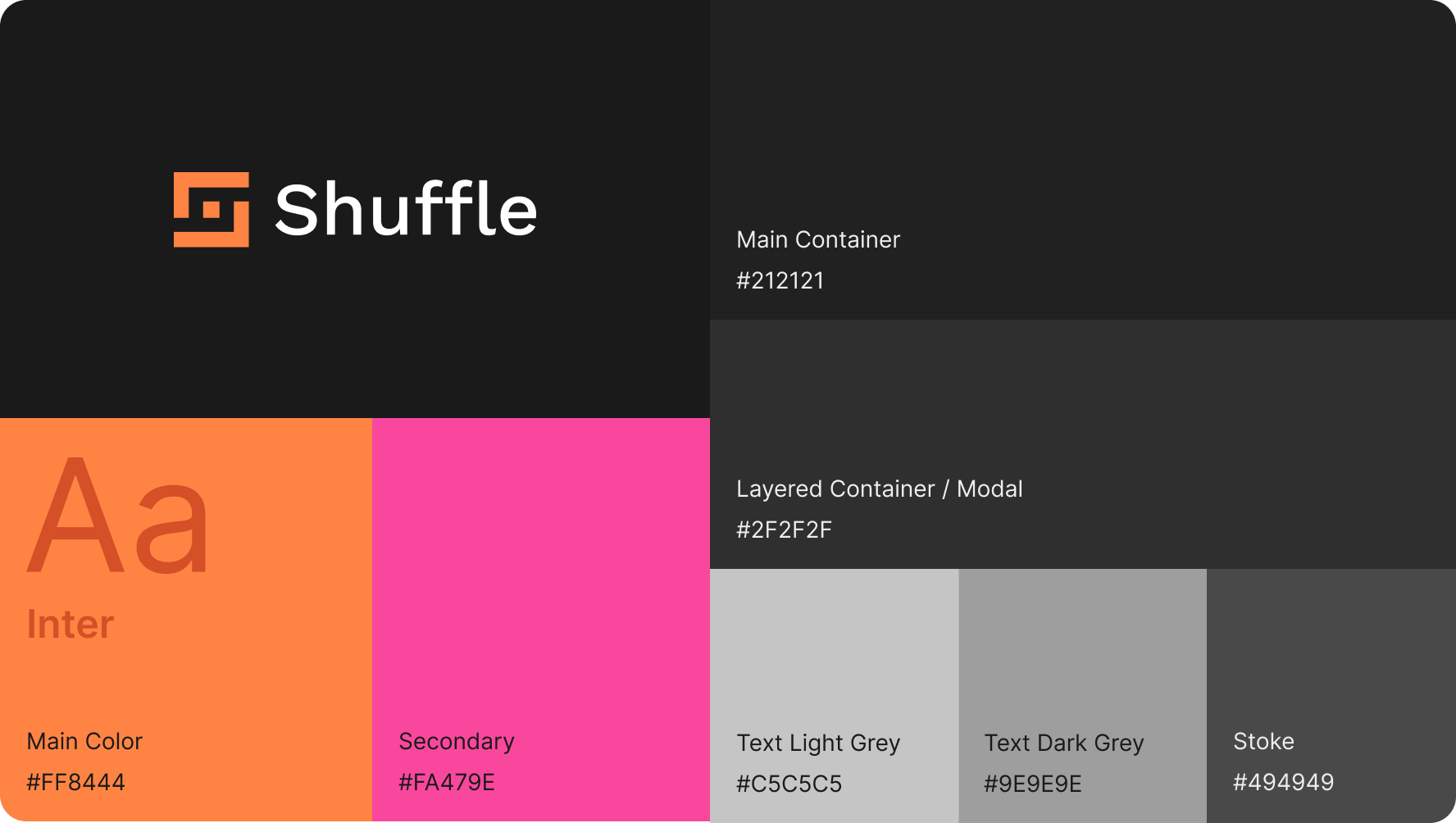
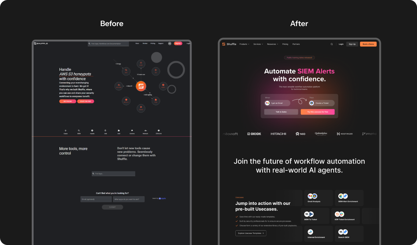
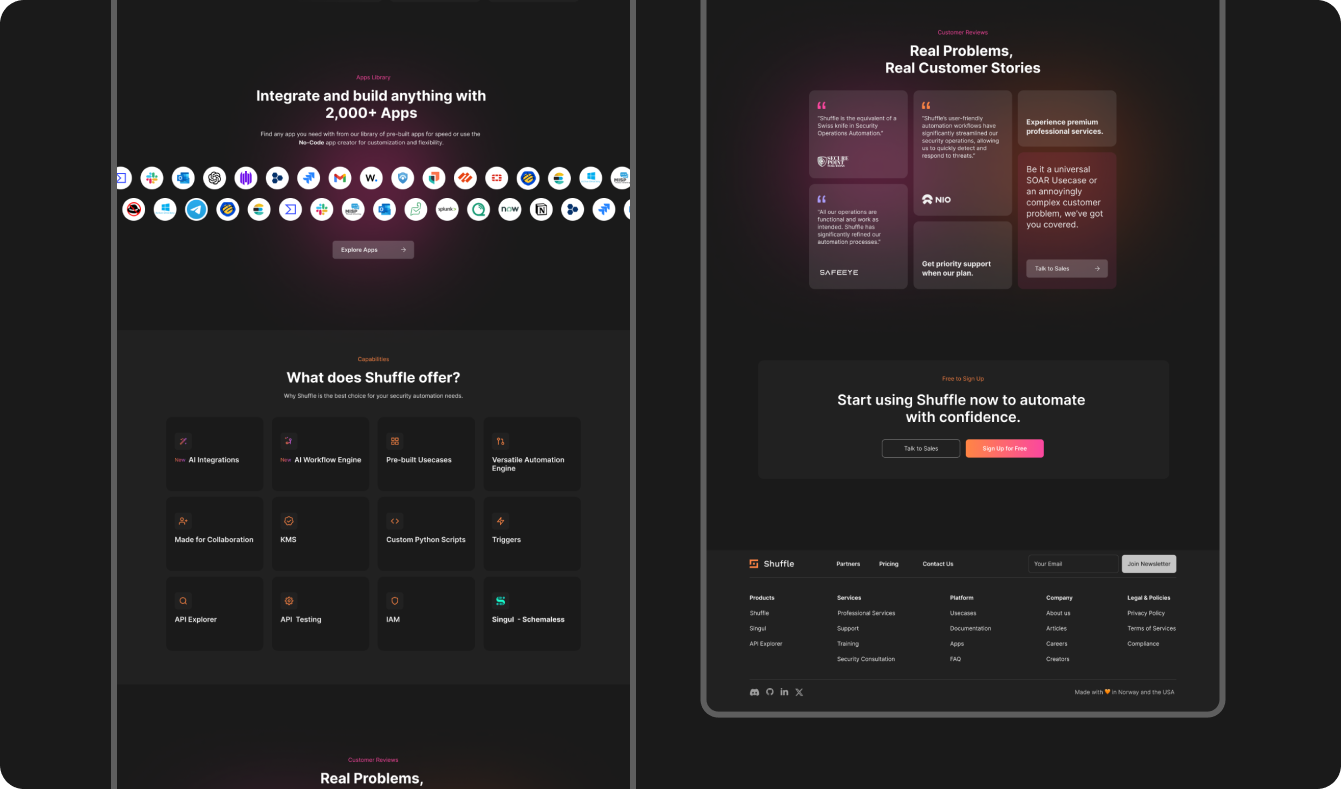
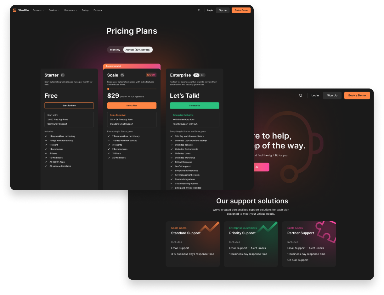
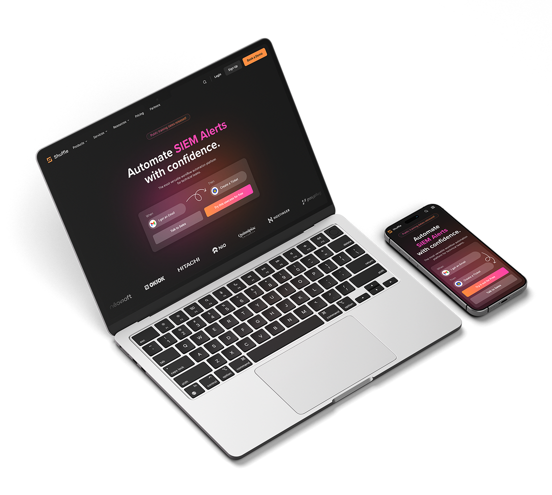
Outdated branding, accessibility issues and
lack of visual hierarchy
The company was lacking that branding edge of a modern tech startup resulting in a visual identity ghat felt dated and disconnected from its innovative core failing to stand against competitors.
Outlining key values, features
and approach.
Before jumping into the redesign we focused on identifying the core features and values we want to communicate as a brand.
Discovery & Audit
Understand the key values and features of Shuffle and decide how to communicate them to the users, then deciding which are most valuable to communicate on the landing page.
Competitor Analysis & Research Findings
Analyzing multiple landing pages of companies in the automation industry was key to identifying common design patterns and see where we needed to elevate our design.
Show don’t tell
Make the website easy to scan through visuals, strong titles and a clear navigation.
Dynamic Experience
Make the website easy to scan through visuals, strong titles and a clear navigation.
Build Trust
Make the website easy to scan through visuals, strong titles and a clear navigation.
Clear CTA’s
Make the website easy to scan through visuals, strong titles and a clear navigation.
Site Map Navigation & CTA’s
Navigation is more than just a menu; it’s an unconscious signal of what a company has to offer. By cleaning up the structure, I made sure the user understood the brand's value through instinct, not effort.
Design
Branding & Final Design
After finalizing the wireframes and copy, I developed a custom design system. I focused on tech-forward aesthetics paired with a unique color palette to ensure Shuffle stands out in a crowded market.
Style Guide
Final Design
screenshots of web pages
Thank you for reading
Please let me know if you have any feedback on my portfolio.